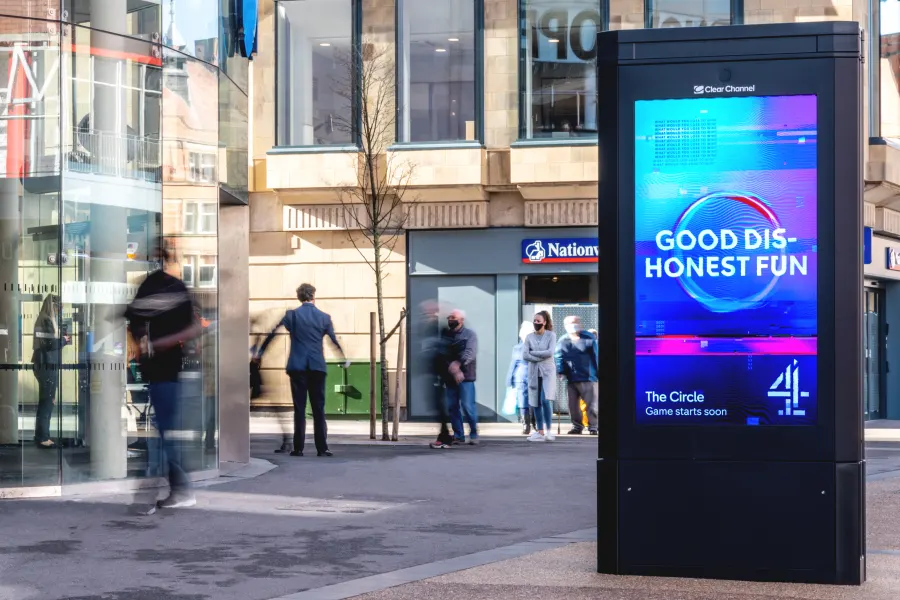
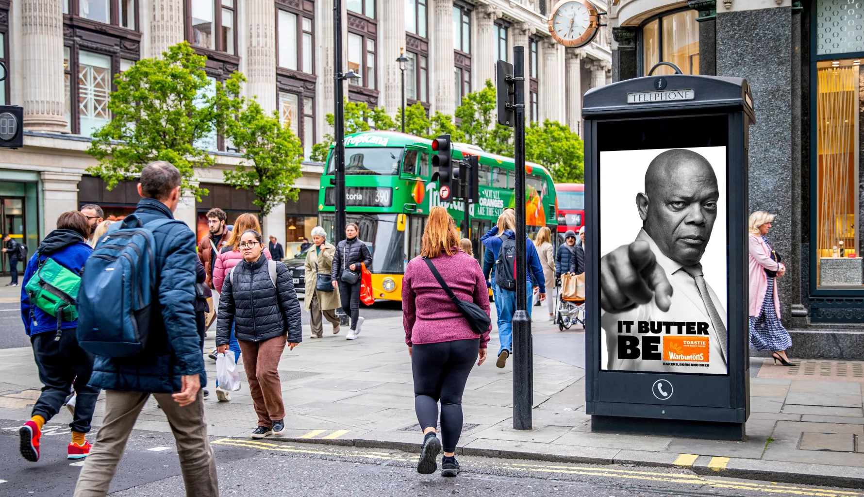
You’ve got your creative idea and media plan. You’ve made the right call by including Out of Home (OOH) advertising. Now, you need the assets. How do you design the best OOH ad?
While much of this advice may seem obvious, it’s frequently requested by brands, creatives, and designers who are new to the OOH space. Our primary advice is twofold:
- Understand the objective of each element in your OOH plan and stay focused on achieving that goal. Objectives may vary based on factors like brand awareness, product consideration, and lifecycle stage.
- View your poster designs as they’ll be consumed in real life, not just on a computer screen. Use resources like the Clear Channel Playground or online tools to visualize your ads in situ.
Legibility
We’ve created a simple framework to help designers craft Powerful Posters:
Simple. Striking. Succinct. Sensible.
Simple
Simpler poster designs are more effective. One clear headline, image, and core message should form the foundation of your ad. According to Talon’s Creative Canvas insight study, simpler designs drive higher attention fixation compared to cluttered ones that make viewers work too hard to grasp your message.
With Digital OOH (DOOH), you have the flexibility to keep messages fresh by delivering one core message per creative as part of a multi-creative campaign. Insight from QMS shows that evolving DOOH creatives can increase memory encoding by 38%.
Striking
Great OOH ads draw attention. Use high-quality imagery, whether product shots or lifestyle photography, with ample negative space for easy inclusion of copy and branding. For roadside formats consumed at speed or distance, use typography with high contrast and larger copy size to ensure your message is easily understood.
Make full use of the canvas, declutter, and lean into your brand and campaign visuals. Bold and bright colours work well in OOH advertising.
Succinct
Keep your message concise. Several industry studies show that shorter copy drives better comprehension and memorability. Posterscope’s research highlights that optimizing copy length and logo size are the biggest creative drivers for increasing brand effects and recall.
Sensible
The composition of your poster should make it easy to scan, process, and understand. Creatives are read left to right, top to bottom. Each element should contribute to your focused objective, creating an easy flow for the eye.
For younger brands or those aiming to build brand health, increasing logo size for better association is sensible. Follow this structure:
- Attract with a key image
- Communicate your message with a clear headline
- Associate with your well-incorporated brand
Making your brand more prominent at the start of the flow will also help recognition.
if you are interested in booking bus stops, please visit www.focusmediauk.com/bus-stop-advertising


