You’ve decided to run a bus stop advertising campaign for your next open evening. You’ve got the media
plan sorted. Now comes the bit that trips up a lot of schools — the artwork.
Designing for out of home advertising is different to designing for print, social media or a school newsletter.
The rules are simpler, but they’re easy to get wrong if you’ve never done it before. This guide walks you
through the proven framework for creating school advertising posters that are impossible to ignore.
The Golden Rule: Design for the Real World, Not Your Screen
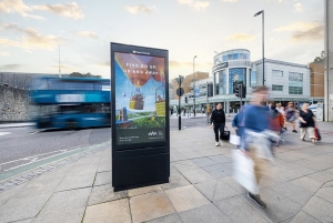
The single biggest mistake schools make when designing OOH artwork is judging it on a computer screen.
A poster that looks great at your desk can be completely unreadable at the roadside, where a parent has
two seconds to absorb your message while walking past or glancing up from their phone.
Before signing off any artwork, view it as it will actually appear — at size, in context, outdoors. Tools like
the Clear Channel Playground let you visualise your school advertising posters in situ before they go
anywhere near a bus shelter.
The Four S Framework for School OOH Design
The most effective outdoor advertising posters — whether for global brands or local schools — follow the
same four principles. We call it the Four S Framework: Simple. Striking. Succinct. Sensible.
Simple
One headline. One image. One message. That’s it.
Simpler designs consistently outperform cluttered ones — not just because they look better, but because
they work harder. Research from Talon’s Creative Canvas study shows that simpler designs drive
significantly higher attention than busy creatives that make viewers work too hard to process the message.
For schools, this means resisting the urge to cram in every open evening detail. Your poster is not a letter
to parents — it’s a signpost. Put the date, the school name and a single clear call to action. Nothing else.
Your poster is not a letter to parents — it’s a signpost. One date, one event, one school. If you’re tempted
to add more, cut it instead.
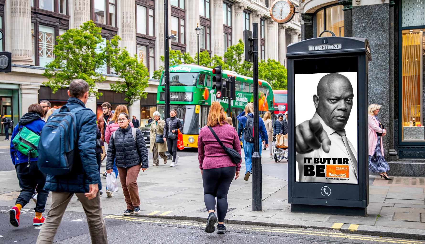
Striking
Your poster needs to stop people in their tracks — even briefly. The best way to do this is with bold,
high-quality imagery, strong contrast between your text and background, and confident use of colour. For
bus stop advertising for schools specifically, think about where your poster will sit — at eye level, in a
busy street environment, competing with everything else in a parent’s field of vision.
Bold and bright colours work well. High contrast between headline text and background is essential.
Negative space — the empty areas around your key elements — makes everything easier to read at a
glance.
Succinct
Keep your copy short. Then cut it again.
Multiple industry studies confirm that shorter copy drives better comprehension and memorability in OOH
advertising. Research by Posterscope identifies copy length as one of the biggest creative drivers for
brand recall — and the shorter, the better.
For a school open evening poster, you need: your school name, the event, the date, and a URL or phone
number. That’s five pieces of information at most. A good test: can a parent read and understand your
poster in under three seconds? If not, it has too much on it.
Sensible
The layout of your poster should guide the eye naturally from top to bottom, left to right. Every element
should earn its place and contribute to one focused objective — getting parents to your open evening.
Follow this structure for school advertising posters:
• Lead with a strong image — a photo of your school, your pupils, or a bold graphic that immediately
communicates who you are
• Headline in the middle — clear, short, readable at a glance: “Open Evening — Thursday 14th
November”
• School name and logo at the bottom — larger than you think you need it, so parents make the
connection instantly
One additional tip for schools specifically: make your logo bigger than feels comfortable. Brand recognition
is everything in school advertising — parents need to know instantly which school they’re looking at.
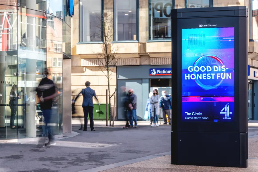
A Note on Digital Bus Stop Advertising
If your campaign includes digital Adshel screens rather than printed posters, you have one extra
advantage — you can run multiple creatives as part of the same campaign, refreshing your message as
the open evening gets closer. Research from QMS shows that evolving digital OOH creatives can increase
memory encoding by 38%.
For schools, this might mean running a general awareness creative four weeks out, then switching to a
more urgent “this week” message in the final days before your open evening.
Digital OOH creatives that evolve over a campaign can increase memory encoding by 38%. For schools,
this means starting broad — “Open Evening Coming Soon” — then getting specific as the date approaches.
Need Help With Your School Advertising Artwork?
At Focus Media UK, we work with schools every day on open evening and recruitment campaigns — and
we know what works. If you need help with artwork guidance, format specifications or booking bus stop
advertising for your next school campaign, get in touch and we’ll help you put it all together.
You can also find out more about our design and print service for schools — we can handle your
artwork from scratch if needed, making sure it meets all format specifications before it goes to print or live
on screen.
Get in touch today for a free, no-obligation conversation.
If you are interested in booking bus stops, please visit www.focusmediauk.com/bus-stop-advertising